The good Lord will probably not punish you for amateurism in your presentations, but your audience will. After all, if you commit the seven deadly sins of professionalism, you'll not only pay for it with dwindling attention, but also with the disdain of your audience. To make sure this doesn't happen to you, this blog post looks at the most common mistakes that make presentations look instantly unprofessional. If you avoid them or prioritize them according to the presentation occasion, you are guaranteed to make a good impression on your customers, partners and audience.
Deadly sin #1: It's all about you
A classic presentation mistake – which salespeople in particular often make – is to focus a presentation entirely on your own company, your own skills, services and products, and not on the customer or the audience. Although experts always try to enforce "the golden rule of audience-centeredness" in presentations, this is often not taken to heart.
Presentations that begin with a long-winded company history, facts and figures, or a profile of the speaker should therefore be urgently revised. Because the unpleasant truth is that in most cases the audience is simply not interested. Instead, they want to take away possible solutions to their problems. Therefore, start your next presentation by crisply outlining challenges your audience is facing and then address how you will help overcome them.
Of course, you may need to introduce yourself or your company at some point. Ideally, do this at the end of your presentation. If you have to start with an introduction, keep it short, interesting, limit it to one slide, and then lead over to your audience by asking questions that fit the topic. This demonstrates interest and creates interaction.
Deadly sin #2: Junk images from the web
Pixelated street signs, clichéd everyday scenes, awkward stick figures, GIFs, comics, or even clip arts: Most of us have had to endure at least one presentation packed with such stock images. Instead of the desired livening up of the slides, such images rather convey that the presenter didn't put any effort into it, or worse, that it represents the (low) standard of his work.
If suitable, high-quality images cannot be found, it is advisable to keep the presentation minimalist. Use a legible font on a calm background and make sure there is enough white space.

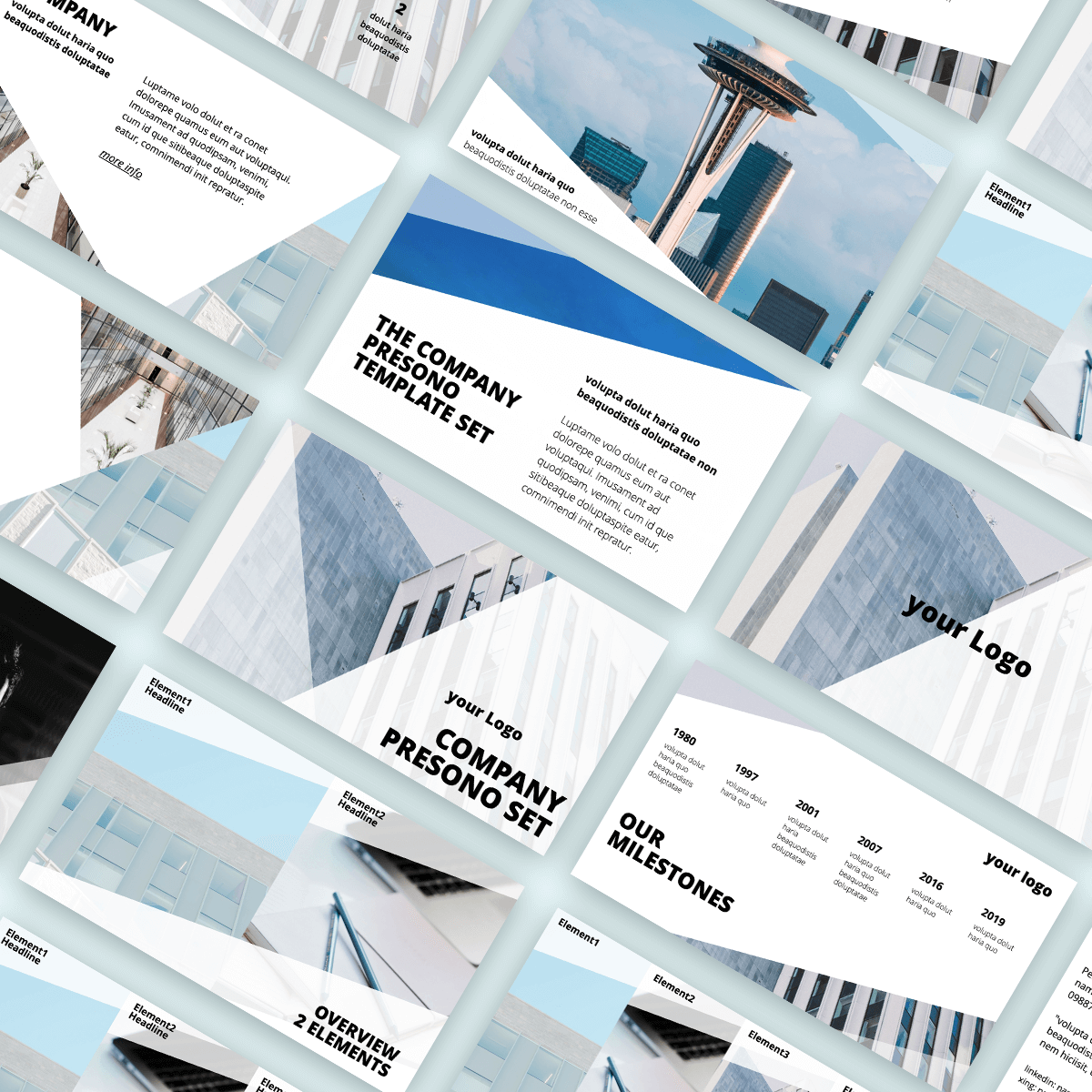
In presono you will find a variety of template sets that provide design support for the creation of professional presentations.
Deadly sin #3: Amateurish animations
If you decide to use animated presentations, you should definitely choose a modern tool with which they can be elegantly implemented. Because nothing looks more amateurish than spinning cogs that are still used in outdated software. When it comes to animations, the following always applies: Less is more!
Appropriate software should also be used for the increasing use of media such as videos, 3D demonstrations & Co. Here it is essential to avoid tools in which you have to close one application and open another. No audience has the time or patience to sit around and wait for you to fix any IT errors due to lack of connectivity of your tools during your presentation.
Here's an overview of the five most advanced presentation tools.
Deadly sin #4: Rigid information
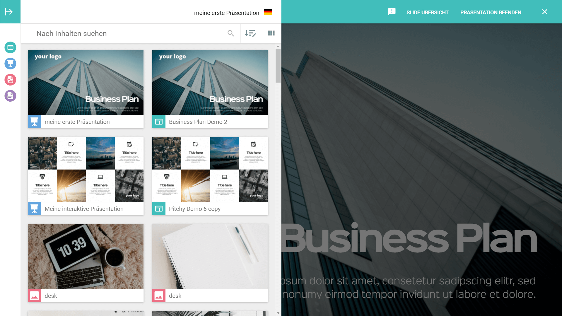
When you use conventional presentation software to prepare your slides, you do so according to a rigid, predefined sequence that cannot be changed – not even if your conversation partners are bored or more interested in other topics. To make a professional impression in today's working world, a high degree of networking, dynamism and agility is required. By this, however, we don't mean hidden backup slides, but interactive search functions and libraries, such as those already standard in sales tools. Presentations should always be able to be adapted spontaneously and relevant content should be able to be inserted and displayed flexibly during the conversation so that the content needs of customers, partners and interested parties can be successfully addressed or an exciting dialog with the audience can be established.

Know how! The Presenter view in presono allows you to insert slides spontaneously without the audience noticing.
Deadly sin #5: Reading off
What is clear on a romantic date is unfortunately often forgotten during presentations: The first impression counts! Eye contact and a likeable demeanor are prerequisites for this. However, hiding behind your notes and reading off your presentation creates anything but a professional image. You also miss the chance to build an emotional connection with your audience. If you include countless "ahms", "uhhs" and "ahhs" due to nervousness, you will have a hard time building trust.
However, the fear of a blackout tempts many people to read from the page. Index cards with key words, for example, are an effective means of speaking freely despite stage fright, without losing the red thread. In addition, memory techniques such as the loci method can provide more security.
Deadly sin #6: Lack of knowledge about the matter
Knowledge is power – this also applies to presentations. After all, you should be able to answer in-depth questions about your presentation. The faster, clearer and more comprehensible you can get to the point, the better. This creates trust with the audience and underpins your qualifications. Otherwise, you will surely go down, because a lack of knowledge will quickly lower your standing with your audience, and you will also lose their attention.
Of course, it may happen that you cannot answer a question. But instead of panicking, here you should resort to a pre-established professional response. For example, you can solve such a situation elegantly with the following response: "That's an interesting question. I'll be happy to find out and get the information to you as soon as possible."

Goodbye stage fright! With these tips you can strengthen your self-confidence before presentations.
Deadly sin #7: The best tools, but no know-how
If you invest in modern presentation technologies, you've already done a lot right. However, the best tools won't do you any good if you can't create relevant content, develop a clear story and convey a strong message. Add to that the fact that you don't know the essential presentation rules and you're unlikely to make a professional impression with your presentation – even if you use the best technical tools. Therefore, familiarize yourself with the most important Dos & Don'ts and perhaps treat yourself to some professional presentation coaching to get you started.