Designing slides for presentations is not always easy. After all, it is not only important WHAT you put on a slide, but also HOW. In addition to expressive images, it is above all the appropriate fonts and colors that contribute significantly to how the audience receives a message and what emotions they associate with it. To ensure that everything works out, we have compiled the basics of typography for presentations, including helpful tips from presono designer Florian Landlinger.
"Words have meaning. Type has spirit." When designing a slide for a presentation, keep this quote from design star Paula Scher in mind. After all, you don't just want to present information, you want to inspire people with a product, a company, a vision, an idea, or simply with yourself. The best way to do this is to touch your audience emotionally - on all levels!
It is therefore best to think of the typography of your presentation slides as the emotion carrier or voice of the written word. It determines how the text is perceived, what effect it has on the reader, and what basic mood is conveyed. For example, if you want to present an expensive, elegant product in a sales pitch, or emphasize your expertise, professionalism and innovation in an investment pitch, you should choose an equally expensive, elegant, or professional-looking font for your slides. However, if - to the horror of all designers - you resort to popular fonts like "Comic Sans", you will confuse your audience more than win them over. After all, a wrongly chosen font can not only weaken a message, but also make a statement seem untrustworthy and even arouse distrust in the audience.
In contrast to the Comic Sans font (first picture), for example, the Sinkins Sans font (second picture) conveys stability and confidence.


Here is what you should look for when choosing a font
So when you set out to choose a font for your product or company presentation, you should think in advance about what you want to convey and how you want to impact your audience. Since fonts and font styles affect us every day, we consequently associate them with the context we already know or have seen. It is therefore a good idea to use these associations in the font search and to determine the desired characteristics of the font impression in advance.
Tip from presono designer Florian Landlinger:
Serious or playful? Expressive or reserved? Elegant or cheeky? Friendly or technical? Traditional or futuristic? Think carefully about how you want your font to look, because the characteristics you choose will translate directly to your brand or the products and services you offer when you design your presentation. In addition, you can think about what other temporal, local or cultural associations should be aroused. The more precisely you define this in advance, the more condensed the selection of suitable font candidates will be.
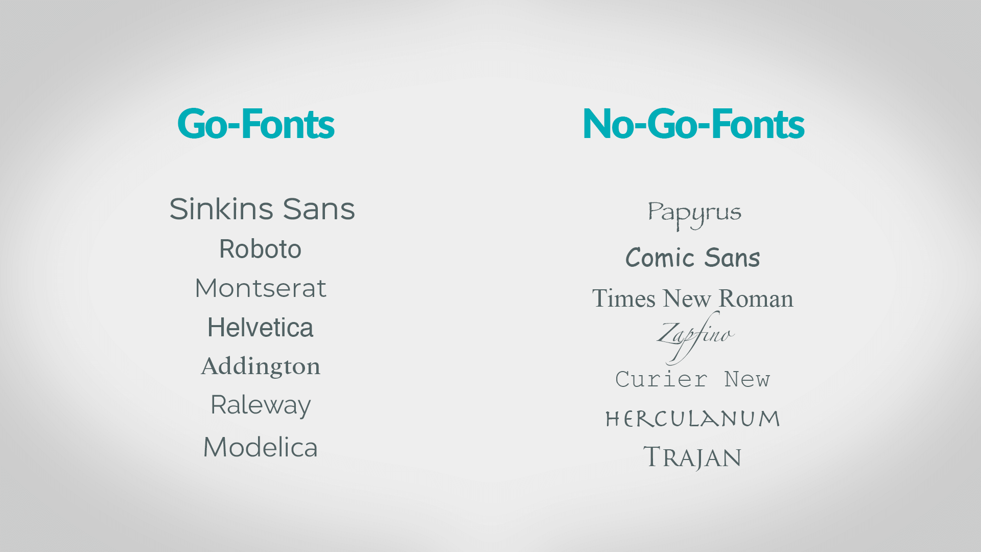
Important: Make sure that the font is easy to read! You should also avoid using cfonts that are reminiscent of movie posters (Papyrus and Trajan) or children's products (Comic Sans). Also fonts like Times New Roman or Courier New, which may work well for corporate documents or web codes, are no-goes in professional presentations.

Here is a small list of fonts that work well in professional presentations (left) and fonts you should never use in professional presentations (right).
The art of combining different fonts
For your slides, you can choose between harmonious and contrasting font comharmonic combination, fonts are selected from a font family (for example, Source Serif Pro and Source Sans Pro or Roboto Slab and Roboto). The mix is then made from the font's own weights, such as Light or Bold weights. In a high-contrast font mix, a thematically appropriate, emotionally charged font for headlines is usually combined with a reader-friendly text font (for example, Oswald and Montserrat or Bebas Neue and Lato Book).
Tip from presono designer Florian Landlinger:
Less is more! This rule should be taken to heart when combining fonts. For professional presentations, the number of fonts used should be limited to two or three - because slides quickly look choppy as the number increases. Make sure to arrange your texts hierarchically if possible. Thus, use a dark-looking, design-strong font for the titles and a lighter-looking, easy-to-read font for the body of the text. It is important that the font styles harmonize with each other. Playful and serious-looking fonts, for example, are not a good combination.
By the way, titles are allowed to pop in presentations! Heavy headers in continuous text can be balanced out with light or thin weights. Sinkins Sans is e.g. a good choice for this. For those who are unsure, so-called "font pairing" sites such as fontpair.co or Typetester can be helpful.
The search has come to an end
By the way, if you are looking for a specific font whose name you don't know, you can use the What the font tool. All you have to do is insert an image of the desired font and the tool will list all similar-looking fonts. Based on this selection, you can not only find the right one, but also download it right away via a download link. If you are looking for fonts in general, Google Font or - for all Adobe Cloud owners - Adobe Font are the best options. Both services offer many (free) fonts that work very well, especially on the web.