Bullet points are - we'll just say it as it is - the death of any presentation and a sure one-way ticket to the center of total boredom. Deep down, we all know that the classic PowerPoint layout, which has been flickering across screens since the 80s, just doesn't work. But then why does the 08/15 slide manage to creep in again and again? Simple: because the "headline + bullet points" formula has become so much the norm in the world of presentations over the past 30 years that people think this is the best way to build a presentation. But we can tell you one thing: they are wrong!
When Robert Gaskins and Dennis Austin developed PowerPoint (then called Presenter), for their sales pitches, in just a few months in 1984, they said they didn't bother with the best kind of information transfer, communication strategies or knowledge sharing, but simply took the easiest route in their design. When Microsoft bought the software for several million dollars right after its release in order to integrate it into Microsoft Office, the two developers' template was just adopted. Since then, PowerPoint actively motivated its users to create a slide based on the default template with a series of bullet points by saying "Click to add text." And like sheep, everyone followed this format without really questioning whether this was actually the best way to go. So the "headline + bullet points" formula became the global gold standard for creating presentations - and millions of audiences have had to suffer the all-too-familiar "death by PowerPoint" ever since. But why don't bullet points actually work?
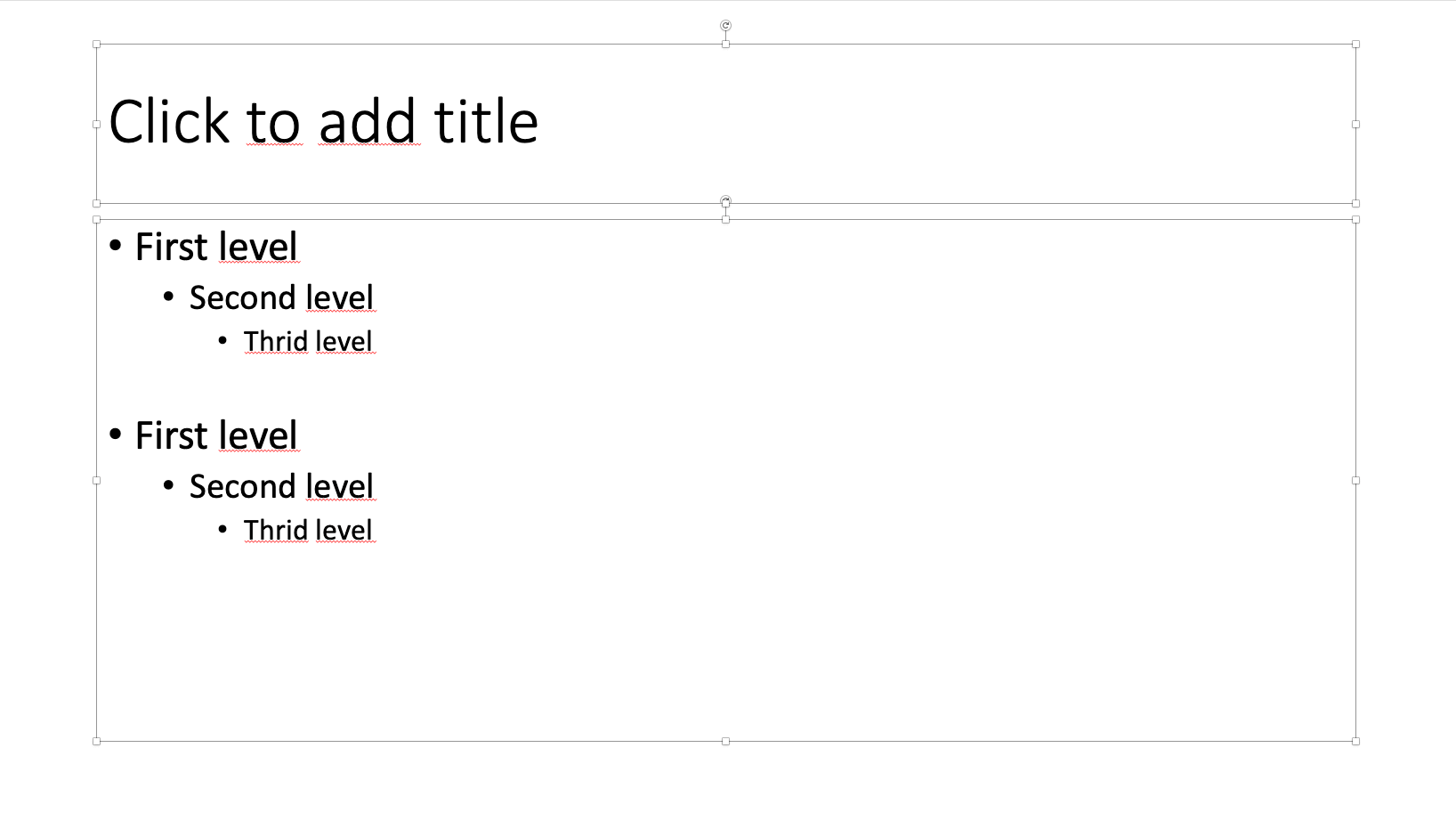
Thanks to the call to "click to add text," the dusty PowerPoint layout continues to find its way into presentations to this day:
Why don't long texts and bullet points work in presentations?
Quite simply, a large part of our brain is responsible for processing visual impressions. So if you want to make sure your audience uses their brains in your presentations, you need to use visual elements. Presenters, on the other hand, unfortunately often rely on text-heavy slides that are littered with bullet points and have listeners staring at them with glazed looks and heavy eyelids. The memorability of such presentations, however, leaves much to be desired. Think about it for a moment: Do you remember a presentation that was littered with text and peppered with bullet points? Can you remember anything about it? Most likely not.
Despite all this, you don't want to do without your beloved bullet points and catchphrases and need inspiration for an alternative slide design? We have put together a few attention-grabbing design tipps for you:
Tip #1: Link your bullet points with an image
Instead of stringing together a list of keywords on a plain background, we recommend linking them to a matching image. But beware, even here it is difficult to capture all the points at a glance. OUR TIP: In presono you can animate the individual points and let the keywords slowly appear on the screen one after the other. This way, you can control the attention of your audience in a targeted way, while your audience is guaranteed to feel well guided.

Tip #2: Work with colors
More text means more creativity when it comes to visualization. Our design team recommends working with colors, among other things, to visually separate individual points when using a larger amount of text. Important: Too many different colors are taboo! Focus on one color group and use targeted animations to build up the slide content piece by piece.

Tip #3: Combine your keywords with an image gallery
For increased memorability, we recommend combining keywords directly with the appropriate visuals. This increases the chances that the audience will remember individual terms and information better. In addition, however, lively storytelling is an absolute MUST!

Tip #4: Use numbers as eye-catchers
Another way to give dusty bullet points a new look is to use design-strong numbers. You can read more about why we almost invariably use the magic 3 here HERE.

Tip #5: Focus on individual statements
Give your key ideas room to unfold and let them impact your audience as individual statements. In this way, you not only generate increased attention, but also ensure that an emotional connection can develop.

Tip #6: Use interactive overlays to make in-depth information visible depending on audience interest
When you start into a presentation, you often don't know in advance which details are of particular importance to your discussion partners. For this reason, we like to use interactive overlays and link individual keywords with background information that can be made visible simply by clicking the mouse. But be careful: Here, too, you should take the general "less is more" presentation rule to heart!
By the way, in our example below you can see a detailed overlay slide that is exclusively sent to the discussion partners as part of a digital brochure after a presentation has been held. Feel free to go into a bit more detail here to provide a more detailed overview or to include important information for documentation.

Tip #7: Let images and icons do the talking
A presentation without impressive images is like Sachertorte without whipped cream, french fries without ketchup, tequila without lemon - you can do all that, but it probably won't leave a lasting impression. So forget the - yawningly boring - bullet points and rely on meaningful images and icons.
We hope you are now ready to leave the dusty slide designs behind and start into the next generation of presentation. With this in mind, we wish you a lot of fun and success in creating numerous creative slide designs!
