If you give presentations on a regular basis, you've probably struggled with the presentation of numbers, facts and figures. Especially the visualization of numbers can be quite a headache. In the next 4,232 characters, we'll reveal how to present them in such a way that they are immediately easy for your audience to understand. Or should we say better, in the next 6 paragraphs with the best 5 tips? As you can see, these numbers become directly more tangible and you can remember them more easily. What else you can do to make numbers, facts and figures more accessible to your audience, we'll tell you now.
The problem with numbers and our brain
When we hear and see numbers, our brain goes into overdrive - because numbers are abstract and have to be "translated" before they can be understood and put into context.
Let's take a test right now. Which of the two examples do you understand faster?
- We founded presono in 2015.
- presono is now 7 years old.
Number 2 is the clear winner in terms of tangibility - after all, you don't have to start calculating here, so you can grasp the number faster. Therefore, think about how you can present your numbers, data and facts as clearly as possible without challenging or overwhelming your audience mathematically or analytically.
With these 5 tips you can present your numbers, data and facts better
#1 Refrain from a flood of info
We already preach the "less is more" principle like a prayer mill. It goes without saying that this also applies to numbers, data and facts. After all, every number and every piece of information that does not directly benefit your presentation distracts from the essentials.
So always ask yourself: Which numbers, data and facts can I leave out because they are less - or not at all - relevant?
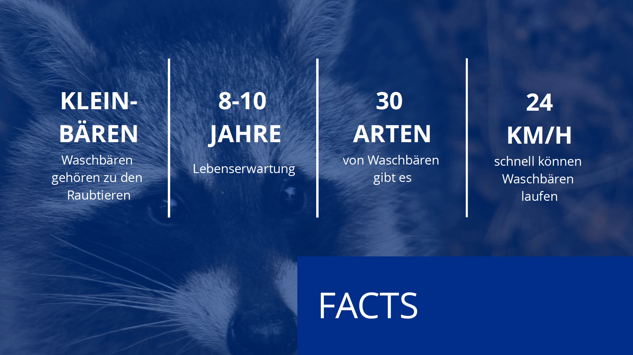
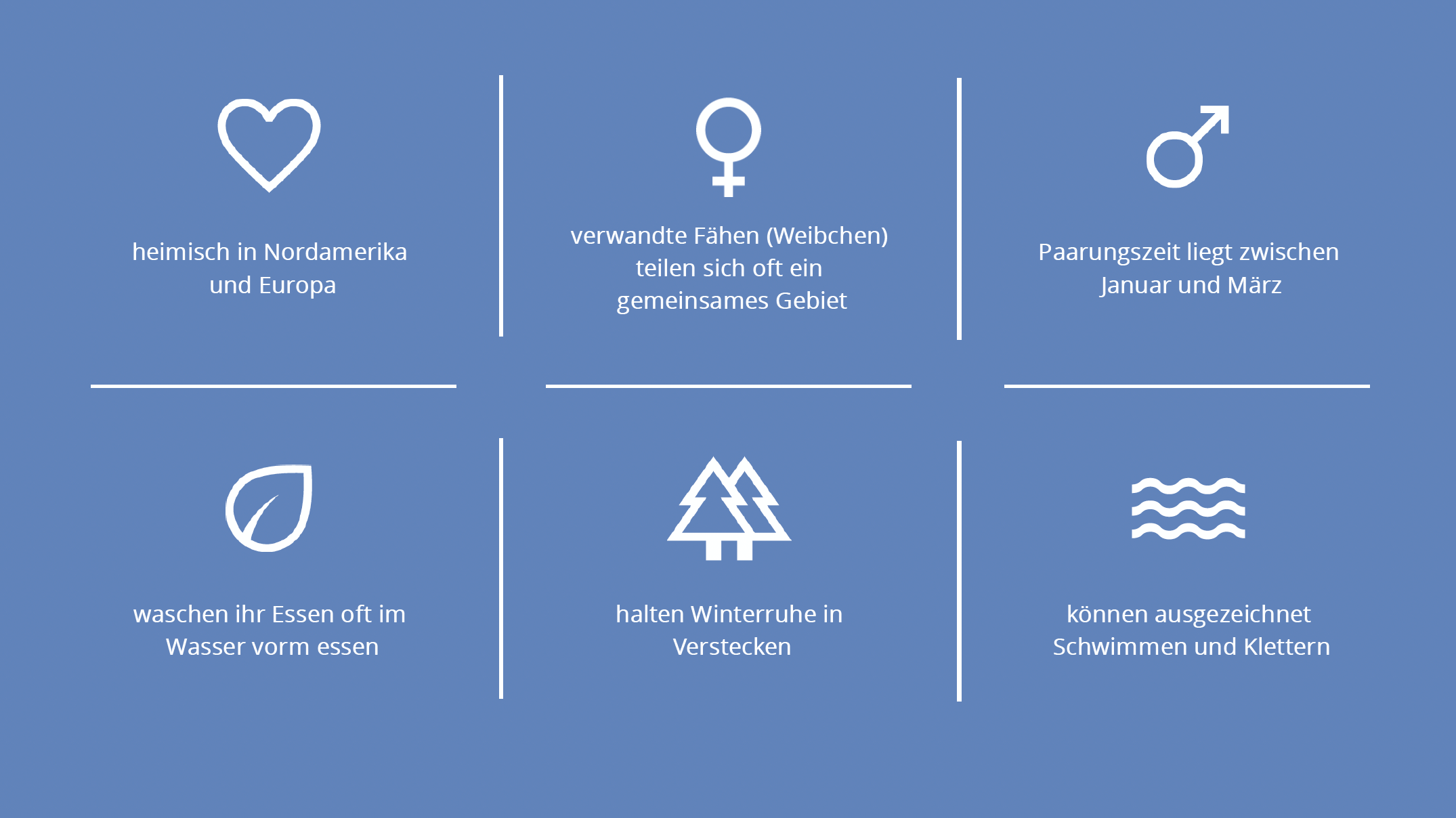
In the following, we present do's & don't examples for the preparation of slides with facts, figures and data.
Attention, text desert! This is not how you should present your information:

Structure and order! This makes it easier for your audience to absorb information:


#2 Round up
Unless you're presenting important research, round up your numbers. After all, it's probably not essential for your conversation partners to know whether your growth is 10.18% or 10% in the course of your presentation. After all, rounded numbers are much easier to remember.
TIP: With presono you can add more detailed information to your slides via links or overlays. So if your discussion partners express interest in exact figures and statistics, you can call them up directly with just one mouse click.
#3 Put numbers in perspective
Naked percentages don't say much. For this reason, it is essential to put them into perspective. To help your audience understand whether "10 percent" is a lot or a little in your context, you should use appropriate comparisons: "That's less than average ...", "That's more than half of last year ...", etc.
TIP: Always present the comparison figure first and then your own. This increases the impact of your own figure, which is then better remembered: "On average, employees need 8 hours a month to prepare various presentations. With presono, they only need 4!"
#4 Visualize numbers, data and facts
First things first: don't include complicated Excel spreadsheets or charts in your slides! This information may be conclusive for you, but it will cause confusion in your audience, or make them mentally jump off - because as soon as the slide appears, the audience starts to orient themselves and study the information. The result: no one listens to you anymore.
As described in point 2, you can of course integrate in-depth content into your slides via links or overlays. However, only call them up if your discussion partners explicitly ask for them!
When presenting curves, you should also leave out anything superfluous. Do without detailed X and Y axes and, for example, mark only one (percentage) number or information including the appropriate year on your curve. This way, the audience can see at first glance what you are talking about. The same applies to bar charts and pie charts.
As a visualization aid, you can mark numbers, dates and facts that you are currently talking about, or that are particularly important, with colors, frames or arrows. In this way, you direct your listeners' attention to the information that is currently of interest. Divided, incremental fade-in of content is also particularly effective for controlling the audience's focus.
#5 Present with passion
You can create the most amazing slides with perfectly prepared facts, figures and data, but if you present them in a monotone or even bored voice, no one is guaranteed to listen to you. But see for yourself!